
Charity Website Design Critique #1: Quaker Social Action
Author: Steve Hawkes;
Reading Time: 9 minutes
We've made this resource open. You are free to copy and adapt it. Read the terms.
If you would like more help with your digital challenge, book a free session with DigiCymru.
This was a series of articles written by Catalyst Resources which asked charities to submit websites for them to critique. They reviewed the design, gave feedback and shared this feedback so that others could learn from it.
We’re doing this because it’s often better to show rather than tell what good design is. We’ve already written plenty about good design.
Site 1: Quaker Social Action
Huge thanks to Catriona Forrest and Giles Robinson for submitting quakersocialaction.org.uk for this crit.
The Quaker Social Action (QSA) site targets people on a low income in need of support (their main audience). It wants to help them find and use QSA services.
It also aims to help professionals and share learning with them.
Giles and Catriona run the site on a maintenance and development budget of £3-5k for this year (2022).
What we did
On October 1st 2022 Steve Hawkes, Co-founder of coop agency The Developer Society spent an hour critiquing the site’s design, user journeys, content, accessibility and performance. All these factors affect user experience.
He did this by looking at navigation, homepage and service pages.
This article shares 16 of Steve’s biggest feedback points. However, he also made 2 videos:
- a 15 minute summary (embedded below)
- a 67 minute full review (linked to in specific places)
Thanks Steve, for doing our first crit so well!
Note that any links to the QSA site may, over time, lead you to pages that have been changed since this crit. What you see there may not match what you see here.
The crit
Steve found lots to like about the site. But because this is a crit we have only highlighted design and usability issues likely to negatively affect the user experience.

1. Top navigation bar
Video crit starts at 5.10 minutes. Includes a check of cookie compliance and crosses over into homepage review.
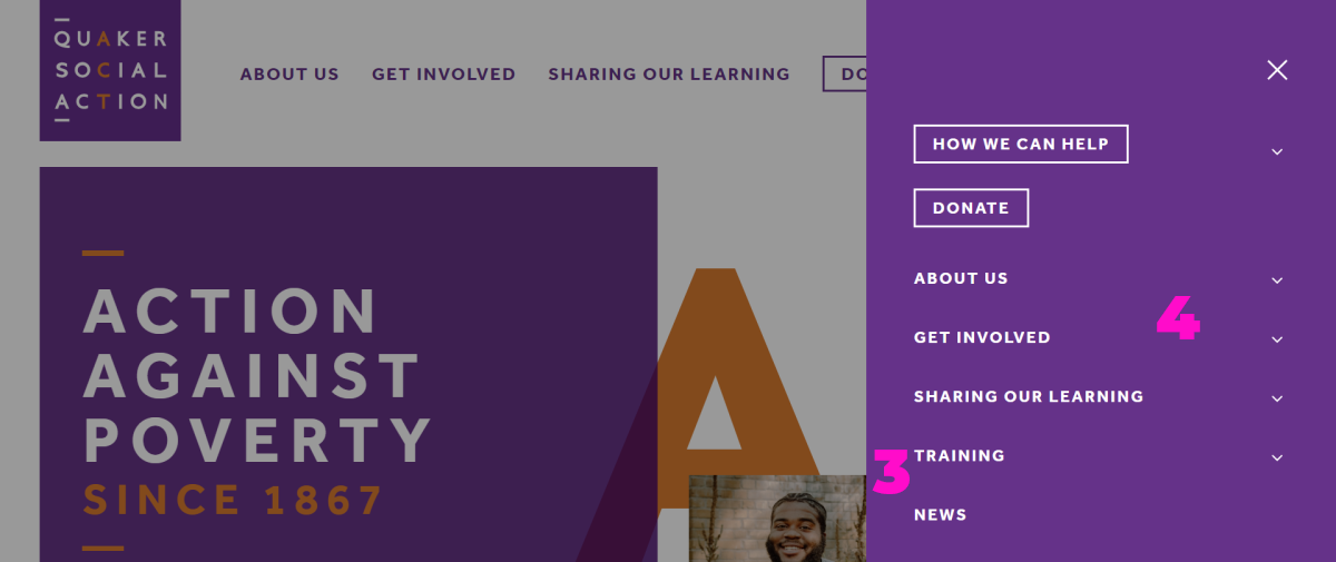
1. The bar is quite clear and has had a lot of effort put into it. It has 7 options, which is the most people can handle before ‘choice paralysis’ sets in.
2. The search and ‘burger’ (three horizontal lines) menu items could be difficult for some users to understand. Text labels, especially for the burger, would help.

3. Clicking the burger menu only reveals ‘news’ and ‘training’ as new primary navigation options. QSA could explore a better way to route users looking for news and training.
4. The large number of burger menu secondary menu items is likely to create choice paralysis (see video). Remove these items and instead lead the user to landing pages to make their next decision.
Make the next step really clear at every point on the site.
Other advice
- Check screen readers can read the search and burger menu item links. It doesn’t look like they can.
- Try to navigate the site using only your browser’s screen reader. This is a great test.
2. Homepage – navigation + design simplicity
Video crit starts at 5.10 minutes as it includes the navigation bar review.
Though the navigation bar is important, homepage content needs just as much love.

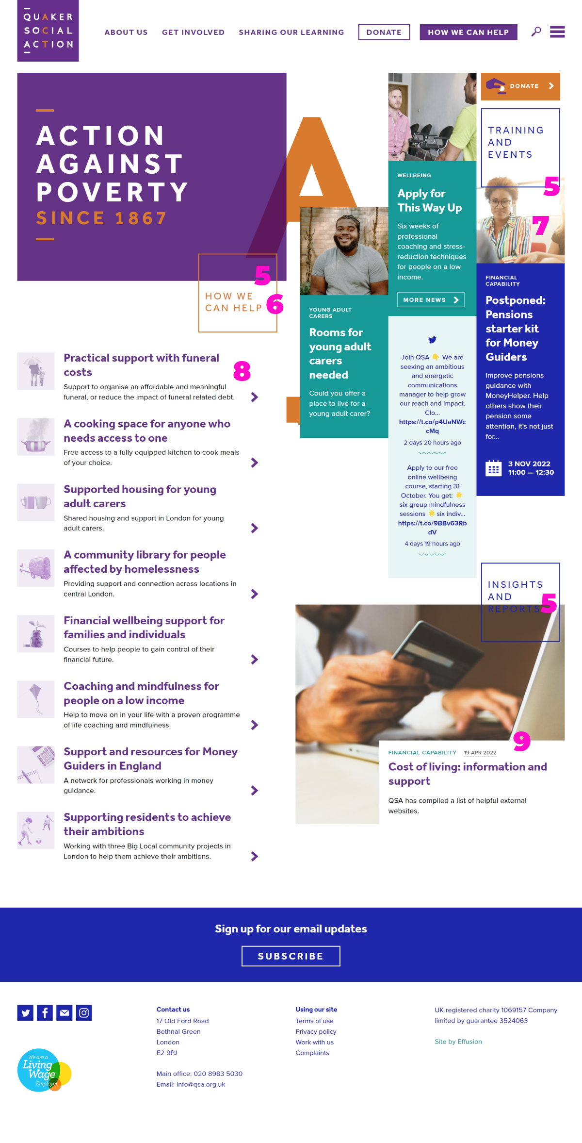
5. Overlapping area titles with images creates an interesting visual complexity, but it makes it unclear and a little confusing.
6. ‘How we can help’ isn’t clickable whereas ‘Training and Events’ and ‘Insights and Reports’ are. This is inconsistent and confusing.
7. The ‘hover states’ (how the cursor changes when you hover over different elements) on the right hand side column are confusing. It’s unclear what will happen when you click on an image, especially where an image underlaps ‘Training and Events’ text. Make links clearer or remove them on images so the cursor doesn’t change.
8. The ‘How we can help’ area uses user-friendly language in its titles but is difficult to scan. This is because the text is repetitive and overwhelming. Remove the explainer text and keep the titles. Align the arrows better with the titles (Example on video at 47m).
9. Visual cues in the ‘Insights and Reports’ section are not clear. The date is underlined as if it was a link but is not clickable. ‘Financial capability’ is not clickable but could be a link to an area of tagged content. Make link clickable areas and visual cues more consistent.
Other advice
- On page load a ‘click here for help’ pop-up appears. Check this is accessible
- Check the page’s colour contrasts with moving backgrounds. Ideally test movement with real people with accessibility needs.
- Consider swapping the Action Against Poverty banner to the right to create a different visual hierarchy of information. Because people tend to scan in an ‘F’ shape and this banner is less important to them than the other content on the page.
- Carry out more font colour and size contrast checks, This can help with visual accessibility. Steve used Webaim’s contrast checker to do this.
3. Service pages
These pages are for people looking for help or support. These users need to be shown clearly what to choose next, especially as they are likely to be experiencing higher stress levels and cognitive load when visiting the site.
‘How we can help’ landing page
Video crit starts at 36 minutes.

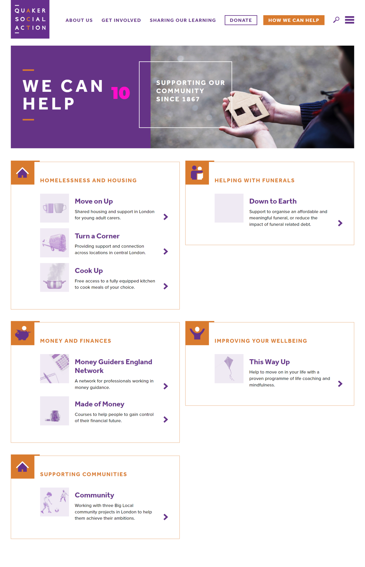
10. The page header obscures the page’s most important content. Consider smaller headers to give more room for content on the first screen.
11. This page is not very scannable on a computer screen. It shows 4 options per screen when the page has 10 options in total. Find a way to show all the options on one screen. Gov.uk is good at this and uses small headers.
12. The language is all internal, and less friendly for users than that used on the corresponding homepage section. This also makes it harder to scan. Use language that users can understand quickly, and reconsider the prominence of internal service names.
‘Move on Up’ service landing page
Video crit starts at 38.30 minutes.

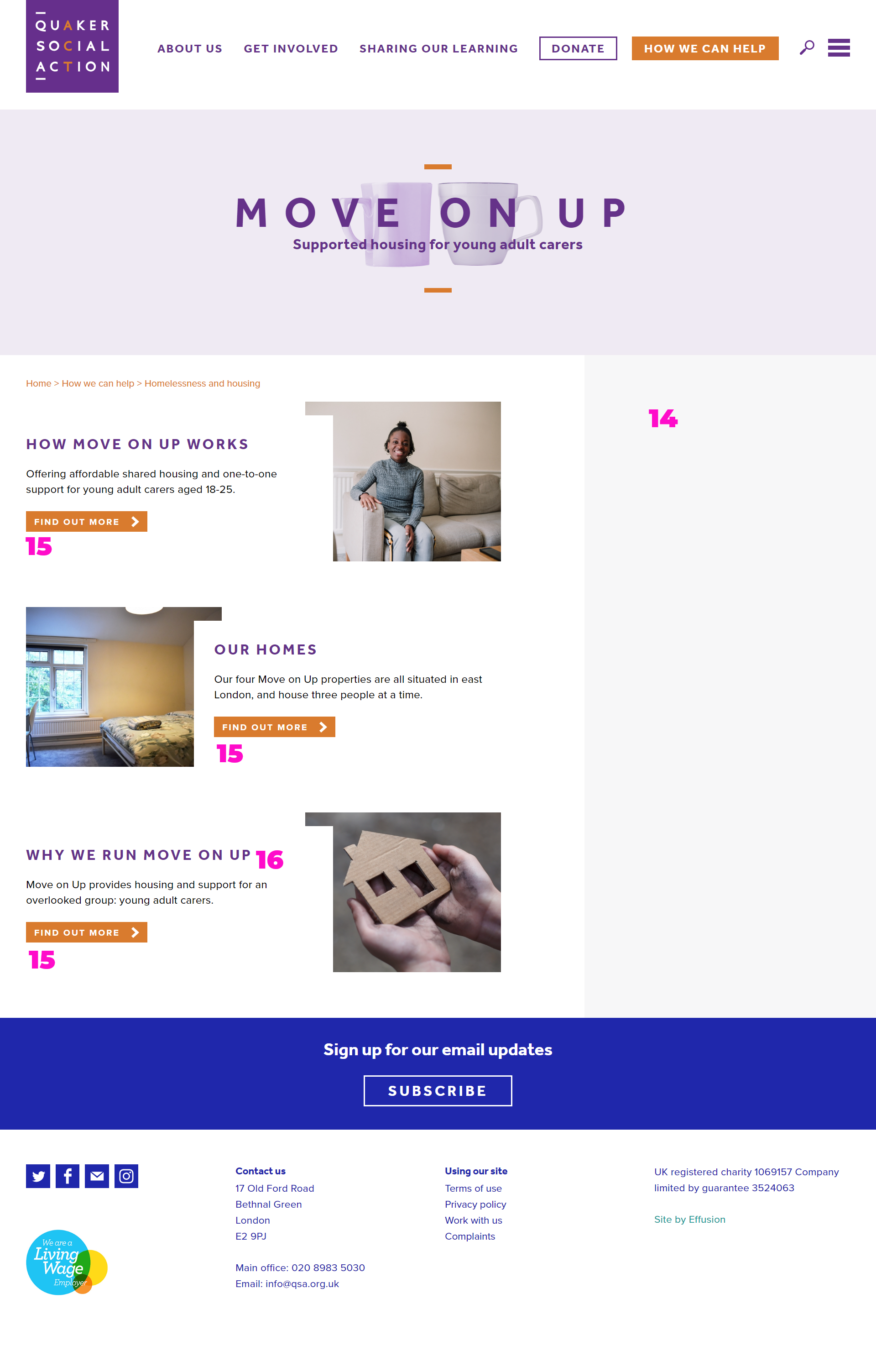
13. The user journey between sub-pages is confusing, particularly for people who want to register their interest. It takes them on a repetitive loop which is unhelpful for people who are stressed and scanning. Develop the user journey and make sure the clearest call to action on each page is the next right step the user should take.
14. There is no online service offer for users and the service’s contact details are hard to find. Help the user know how to access the service better or show them how to get other help.
15. ‘Find out more’ is unhelpful link text. It doesn’t help the user know if it’s the right option for them. Ban it from the site and create better, more meaningful text.
16. The ’Why we run Move on Up’ sub-page isn’t very relevant to users. Make it relevant or move information like this and evaluation reports to a different area for the relevant audience. This will help users who only want to know how to access a service and don’t want to be distracted by things that aren’t relevant to them.
Make each page amazing for its audience. Do less, better.
Advice for other service pages
- Check for dead-end buttons in all ‘How we can help’ pages. The video shows some of these.
- Replace all other ‘Find out more’ link text with more useful text.
- Remove all links to information for professionals or supporters (e.g. why we run move on up or what difference does down to earth make?
- Try to reduce the number of pages for each service. Make the most important information more prominent e.g. 48.50 for ‘Turn a Corner’. This creates a clearer and simpler journey for users. It also reduces the organisational overhead of managing too much content.
5. Site performance
Video crit starts at 21.30 minutes. Steve used Google Lighthouse to measure site performance.
Site performance is important because page load times affect user stress levels and people’s trust in your site..
Advice
- The site’s font is slowing the site down because it is pulling the font from Adobe fonts. It could be self-hosted to improve the speed or could be replaced with more standard webkit fonts.
- Check the theme is up to date.
A note on site cookies
Steve explores what is happening with cookies at 9.05 minutes on the video.
What we didn’t include
- Critique of supporter/donor content. This is in the video at 50.45 minutes.
- Critique of ‘Sharing our learning’ content for professionals. This is at 57.15 minutes.
Crit summary video
Watch the 16 minute summary below.
Or watch the full 67 minute raw crit.
QSA website details
This is what Catriona told us about Quaker Social Action’s website.
URL: quakersocialaction.org.uk
1. Site target audience
- People on a low income in need of support – could be experiencing homelessness, funeral poverty, mental health difficulties, be a young carer and more. Some services London-only others UK wide.
- Professionals working in the third sector, especially money guiders and advisers
- Actual or potential donors – often people who are Quakers
2. Site goals
- Help people find and use our services, both frontline & online resources
- Share learning with professionals and raise awareness of issues
- Fundraising
- General information and awareness of the charity and its activities
3. Any known problems/concerns about your site?
- Navigation – because our projects are quite different and address different needs and people, it’s tricky to avoid long lists of services and it can be hard to easily find what you need
- Design could be simplified and adhere more closely to a F shape reading pattern, especially on landing pages for sections and menu
- I imagine there could be accessibility improvements though we have made a start with this
4. Last redesign
- 2017
5. Site responsibility
- Joint responsibility – myself Catriona Forrest, Digital Communications Officer, Giles Robinson, Communications & Marketing Manager, and Peter Christmas, Head of Fundraising and Communications.
6. Annual budget
- This year they have a web development budget of £3-5k.
Commissioned by Catalyst
