
The three stages of digital product development
Author: Georgia Iacovou;
Reading Time: 10 minutes
We've made this resource open. You are free to copy and adapt it. Read the terms.
If you would like more help with your digital challenge, book a free session with DigiCymru.
Let’s be honest: hearing or reading jargon can be alienating and counter-productive. When you’re collaborating on a digital project, you’re probably going to be working across disciplines. The last thing you or anyone wants is to be intimidated by the language used in your catch up meetings.
We all use sector-specific jargon without realising it; avoiding it altogether can be tricky, and even a roadblock to getting things done. In this piece, we’re going to take you through the typical phases of digital product development, along with the jargon that you should expect to hear, and what it all means in context.
Here’s a breakdown of the digital project journey we will take you through — this isn’t necessarily how all digital services are built, but more of a high-level overview of typical key stages in projects like this.
- Product development: designing and building the digital service. What will it look like, and how will it work?
- Product deployment: releasing what you’ve built into the world, testing it, and making necessary changes
- Marketing and performance: making sure that those who will benefit most from your new service are aware that it exists, and that it works best for them.
We also want to briefly touch on user research, which should come before product development. This is where you engage with your challenge or problem rather than the solution, and where you research your users’ behaviour and their needs – after all, you don’t just want to build something based on your assumptions, but on data and evidence – you’re aiming to build something that works for the people who need it. There are lots of different ways to approach this: Catalyst’s User Research resource bank contains a wealth of information on understanding user needs.
Phase one: product development
Once you’ve secured a budget, you can start building and designing. If you’re not yet at that stage, have a look at our resources on getting funding, and even getting the rest of your team on board.
So, what are you building? Let’s run with a hypothetical example that has enough moving parts to inspire plenty of jargon: an interactive map which shows the locations of empty, disused buildings. Let’s call it ‘Empty Property Finder’.
- The map provides information on who owns the buildings (private companies, local authorities, etc), and if they are for sale or to let — or even available for free.
- This information might be useful for other organisations who are looking for spaces to deliver their services: e.g. refuges for survivors of domestic abuse, or even vaccine centres.
- Anyone can use the map to find empty spaces; anyone can add buildings to the map.
Now that you know what your service is going to do, it’s time to engage in some jargon-heavy conversations.
Your designer might talk about building a wireframe or a prototype, so that you can see the rough layout of how your Empty Property Finder will look, without any actual content. This will probably be thrown together in a popular design tool such as Figma, so that you can play around with the look and feel of your service. This is so you can decide things like what screen a user is taken to when they click the ‘add property’ button, for instance.

All of this stuff falls under the umbrella of UX, which is short-hand for user experience. This is a term widely used to describe what an app or service is like to use. A quick way to understand what UX is to actually use a bad example: if you’ve ever found yourself thinking ‘where on Earth will this button take me when I click it?’ after filling out an online form, you’re probably interacting with some bad UX. Good UX is usually hardly noticeable at all.
Your designer will be collaborating closely with your software engineer(s), who will actually build the Empty Property Finder. An engineer will implement the designs so that they look exactly as the designer intended — this is what the frontend is; it’s the stuff that the users see. The other key engineering task is to get everything working behind the scenes, or in the backend, so when a user hits ‘add property’ all of the relevant information is sent to your service, and the map is updated. For more on the differences between types of design, see our design jargon blog.
Something else you might hear about at this stage: APIs.
The Empty Property Finder relies heavily on the use of an interactive map with dropped pins that contain key information, a lot like Google Maps. Building your own interactive map from scratch would be difficult and expensive, so it’s very likely that your engineer will simply use an API – which stands for ‘application programming interface’, and is:
- A small piece of software that plugs two services together, so that one service can benefit from the functions of another
- So in this case, the Empty Property Finder would be using an API provided by someone else who has already built a map. Such as Google Maps or the lovely OpenStreetMap.
The use of an API may seem very specific to our example, but engineers rely on them heavily to build higher quality products and services.
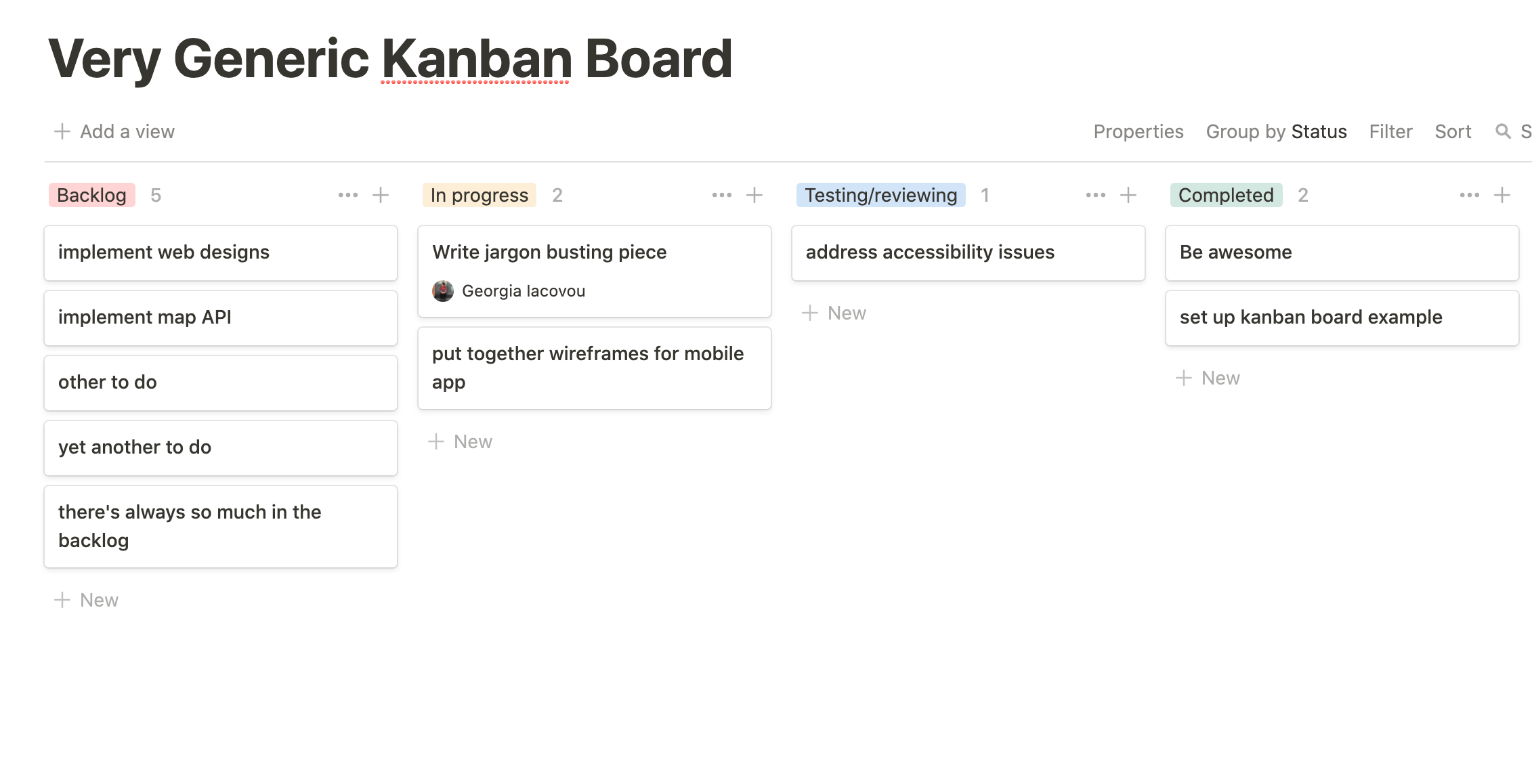
Finally for phase one, if you’re working with a product manager, they will be the one setting and prioritising tasks for the engineers and designers. To do this, they may use tools like Trello or Jira, which layout tasks in a kanban board. This is just a simple way for everyone in the team to track progress. A product manager may want to separate tasks into sprints, which are essentially blocks of time in which to achieve a particular goal. E.g. a sprint could be two weeks, and by the end of it the team should have built the frontend of the mobile app based on the wireframes provided.

You’ll notice the left-most column is called backlog. This is just the stuff that hasn’t been started yet — in a digital project like this one, it will basically consist of features and bugs (anything that might be broken) that have not yet been implemented or fixed.
Phase two: product deployment
You’ve played around with the prototype of the Empty Property Finder, and tested it on a handful of users, and are happy with how it works; the engineers have been working away to put it all together. Soon it will be ready for release. Perhaps you hear a lot of talk about releasing an MVP. This stands for minimum viable product, which is essentially an early version of your Empty Property Finder, which you will continue to improve.
This is exactly what iterating is: you continue to build, even when your service is live. It’s nearly impossible to know exactly where any problems might lie before anyone starts using it, so you identify these as you go along, and make regular updates.
Good job you’re working iteratively because would you look at that: you’ve started receiving emails about the ‘add empty property’ button not working. Something’s broken, but what? You can easily roll back to an earlier version so that people can still use your service while you figure out what went wrong. This kind of process is handled with Github.
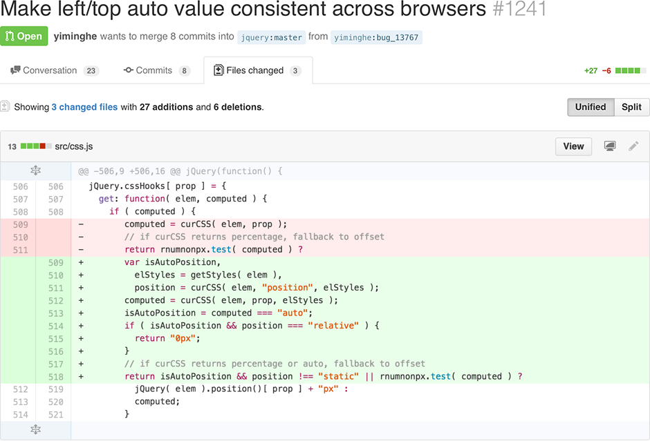
Engineers use Github to collaborate on the code they are writing. If multiple people are building the same thing, Github allows them to see who has added what code and when. This is even useful when it’s just one person building, because you can see all past versions of the code and jump back to when things were working.

Now that the Empty Property Finder is being used by a few different people and organisations, your designer will want to know how well the UX is working. They might do this by working with an engineer to implement an A/B test: where you release two versions of the Empty Property Finder at the same time, to see which works best.
Something else you might hear about at this stage: user stories
Your designer is going to be paying close attention to how your users are interacting with this service. Where are the pain points? Is there anything in the design that’s making the Property Finder harder to use? This is where defining user stories come in. These help you think about:
- Who is using your service
- What they are using it for
- How easy it is for them to get the most out of it
So a user story is literally a statement from the user’s point of view: “As a [type of user], I want to [goal], so that [benefit]” but with the gaps filled in. For your service, that might be “As someone working in VAWG, I want to find empty houses so that I have refuge space for survivors of domestic abuse”
For more on this, take a look at our blogs on taking action once you’ve written your user stories – and turning your user stories into a prioritised action plan.
Phase three: marketing
You’ve seen a need for your service, which is why you created it — but ‘need’ isn’t always enough to get people to discover and access your services. We aren’t going to explain how to do this here, that’s a whole other article.
However, digital marketing comes with its own jargon: a lot of it is to do with measuring performance. So you might notice — via analytics tools such as Google Analytics or Matomo — that plenty of people are visiting the Empty Property Finder, but then they leave straight away. If the majority of visitors do this, you have a high bounce rate and will want to take steps to reduce it.
You may even use a tool, such as Hotjar or Mouseflow, that can create heat maps, which show you things like what buttons are most clicked, and which pages (or parts of a page) people seem to hover on the most. Looking at things like heat maps and bounce rates help you figure out what is and isn’t working in your service.
This brings us to the end of this jargon-busting guide — there’s just one more key buzzword that we’ve avoided using until now: agile. That’s because the majority of the processes described in this article are all part of the agile methodology. Now that you understand agile in context, you can take a deeper dive into our comprehensive Guide To Agile. If you’re pressed for time, the key thing to remember about agile is: most people who use it, do not talk about it. Most people who talk about it, do not understand it.
Commissioned by Catalyst
