


North Wales Women’s Centre – Rebrand
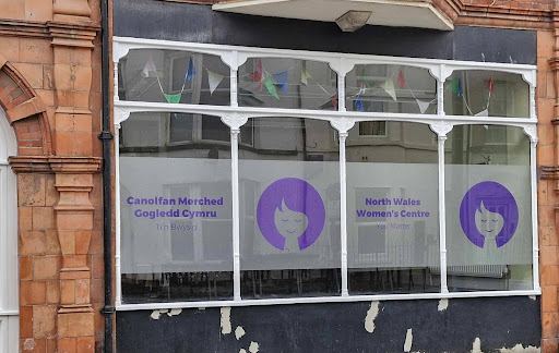
Helping North Wales Women’s Centre to rebrand

Client
North Wales Women’s Centre
Sector
Third Sector
Partners
Lloyds Bank Foundation
Services
Rebranding
Co-design
We’ve worked with North Wales Women’s Centre (NWWC), thanks to Lloyds Bank Foundation, to create new visual resources and a message that works. NWWC is a local charity whose mission is to cultivate and advance the social and economic development of women in their community.
What was the problem?
NWWC sought a new look and resonant messaging for their brand that was modern and accessible and fully reflected its mission and services. Staff at NWWC identified that the existing brand felt outdated and didn’t communicate who they were and what they did.
Our approach
1. Consultation
We worked closely with the NWWC team to understand what they needed from the rebrand, and learned their core vision, mission and values. These guided us throughout the process.
2. Competitor research
We began by reviewing other organisations’ logos and identities to find opportunities for NWWC to stand out while staying recognisable within the wider network.
3. Tagline
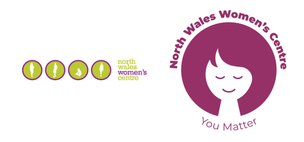
We defined the organisation’s unique selling points. We discussed the emotions they wanted the brand to inspire and reviewed competitor logos and taglines for inspiration and differentiation. This led to the creation of their simple but powerful new tagline: “You Matter”.
4. Logo
We developed three initial concepts and refined the chosen direction with the team. The final design reflects the core values of NWWC – togetherness, warmth, support, happiness, and simplicity.
- Design inspiration: We drew inspiration from a calm, meditative woman’s face and circular forms to symbolise community, women supporting one another, and a sense of belonging, much like a badge of identity.
- Colour choice: We chose purple as the primary colour for its connection to the organisation’s previous logo and women’s services. The colour purple conveys care, empathy and insight which are qualities we aimed to reflect in the brand. It also works well for its accessibility alongside the secondary palette.
- Continuity: As a nod to the old logo, we incorporated a simplified silhouette to honour their history, while feeling fresh and modern.
5. Wordmark
For the wordmark, we chose a bold, modern sans-serif typeface. This ensures the brand name is easy to read at any size. Sans-serif typefaces are often linked to contemporary, approachable, and forward-looking brands, and the bold weight provides visual balance, complementing the logo’s icon without competing for attention.
Outcomes
The result is a memorable and inclusive identity that works across print and digital platforms. The new brand honours NWWC’s history and feels welcoming and empowering.
What the NWWC team said
“Everyone is thrilled with the results so far and absolutely love the new logo … a huge thank you for everything you have done!”
Work with us
Our approach is about understanding user needs and working with people to create a brand identity that aligns with your values. If you’re ready to refresh your brand, we can help.
Get in touch at Auguste@promo.cymru to start the conversation.

