

Why good content design is important for your charity
Awdur: Joe Roberson;
Amser Darllen: 7 munud
Mae hwn yn adnodd agored. Mae croeso i chi ei gopïo a'i addasu. Darllenwch y telerau.
Os hoffech gymorth pellach gyda'ch her ddigidol, trefnwch sesiwn am ddim gyda DigiCymru
Content design. Designing content.
It’s more important for your charity’s website than you probably think.
It’s important because you will have a website and people will read (or scan) your site.
It’s especially important if your readers are stressed, have cognitive difficulties or are overwhelmed in any way. Your content wants to help them, not add to their day’s challenges.
This means your content needs to be accessible (easy to understand).
Even if your website looks nice, bad content will make it less accessible (harder to understand).
This article shows you what content design is through 3 examples: 2 web pages and 1 online form. Looking at examples is a good way to start thinking about content design.
We’ve already written about how to use content design to help people access your services more easily. Read that after this article.
About content design
Content design is a way of designing the words, forms and other written or video content you use on your website and other online places. It blends skills from service design and copywriting. Its methods can also be applied to documents and anything that people will read.
Content design combines care and insight to create accessible content.
Care = being thoughtful and considering how your users will experience the content you create.
Insight = using evidence and data about people’s needs, behaviour and experiences to inform decisions about content.
Content written without care and insight into your users will be harder for them to read and understand. They are more likely to not find what they need and leave your website.
“The main difference between many other forms of writing and content design is that content designers generally don’t move without research. It can be desk research, usability research, expert research, any kind of research really but there has to be data and evidence of what the audience wants and needs.” – Sarah Richards
Example 1: Website content design
Here’s an example of good website content design.
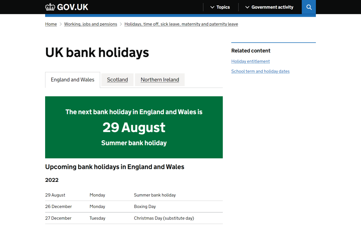
The page title is clear and the page does exactly what the title says.
Right away you can see when the next bank holiday is. It’s visually memorable too.
And you can scroll down to see the next one, and the next one. Good for mobiles.
There’s also little to distract you. Sentences and labels are short. Other menus are discrete. And you can easily see where you are through the ‘breadcrumbs’ above the page title.
Now look at this example taken from Directgov in 2009.
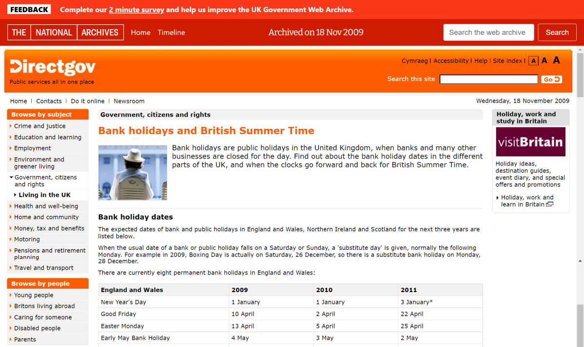
The page title covers two things. That’s not ideal, and besides, users think ‘when do the clocks change?‘ not ‘when is British Summer Time?’
Your eyes and brain have to work harder to see when the next bank holiday is. To find other holidays you have to look both across and down the table.
And there’s a lot of other menu items and content going on. Perhaps some of it is useful, but you have to work to decide that. And some of those sentences are much longer than they need to be. Phew!
Example 2: Forms and interactive elements
Forms are another important place to think about content design. It could be a form on your website or a form on a document.
Whatever the form, filling in one that’s been designed without care and insight is difficult and can lead to people abandoning it unfinished.
Here’s an example of a good form.
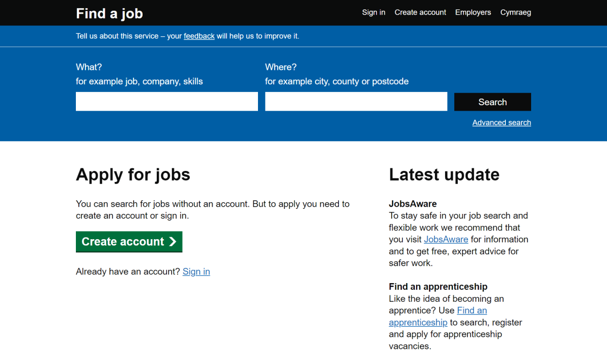
Notice how simple the page title is: ‘Find a job’.
Now look at the blue area. See how simple the labels on the form’s two boxes are? And the example text is short, direct and uses common words.
‘Advanced search’ uses the same words and is in the same place as on many other websites – it’s where the user would probably expect it to be.
The search button is placed close to the form’s boxes. Buttons and checkboxes are more about visual design, but it’s helpful here to understand how they support the overall design of the form.
Also, there are only two boxes to fill in. This is good because once you go beyond two choices, people take exponentially longer to decide what to do – Hick’s Law proves it.
You can try out the form.
Now look at this example from DirectGov’s jobs site in 2012.
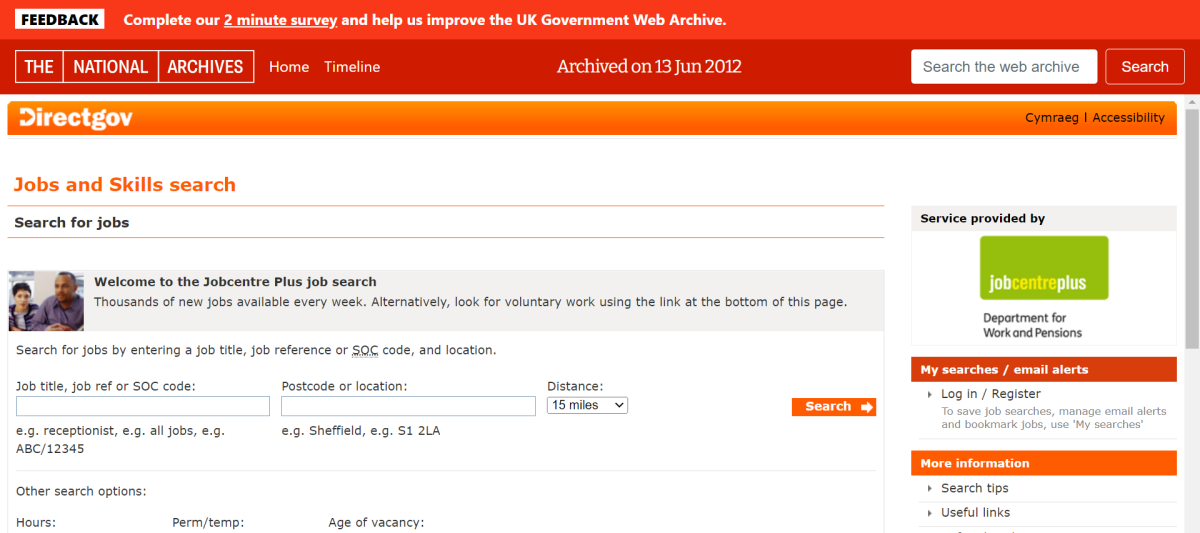
Notice that it tells you four times that this is a page to search for jobs, instead of only once. That’s a lot of words distracting you.
Look at the form. The ‘help’ text repeats itself. It uses abbreviations and acronyms (what’s an SOC code?).
There’s three boxes to attend to, even if you decide to leave the third as it is.
And the search button is a bit distant from the rest of the form. This is more a visual design issue, but it reflects the overall poor design (though remember this was back in 2012!)
Accessibility and inclusion
Taking care with your content includes considering how inclusive it is, and whether it inadvertently enables oppression of people and groups. We’ve written a resource to help you create inclusive and anti-oppressive content. Content Design London also wrote about the importance of inclusive content design.
Following accessibility guidelines also makes your content accessible to those who would otherwise struggle with it. This includes:
- Adding ALT text to images (screen readers – that is, software that enables people with visual impairments to access digital content – can’t describe images)
- Avoiding images with text in them (screen readers can’t read them)
- Avoiding PDFs on your website (screen readers struggle with them)
- Testing how your content appears on mobile screens, as well as computers
- Keeping your web content up to date
- Making your page content suit people’s reading patterns
Testing your content will also help make it accessible.
“You can follow guidelines but only testing will make your content truly accessible. This is especially true for users who may have some form of disability where your site may be a lifeline. Don’t assume you know your users and everything about them. Test with them” – Gem Hampson, Director, Hactar
Good visual design improves good content
Visual design is important too. When combined with good content design it creates good user experience (UX) design. Visual design includes:
- Look and feel of a site
- Interface elements like buttons, form fields, navigation elements
- Anything else a user sees on your site including pictures, logos etc
These elements are all important for creating a supportive, inclusive experience for the people visiting your website and using your services.
“Visual design also needs to support inclusion, agency, empowerment, reassurance, support, wellbeing, creativity, healing and a general enrichment of people’s soul and spirit rather than only task completion.” – Ellie Hale, Producer, Catalyst
Example 3: Good content and visual design
Look at this example from Chayn.
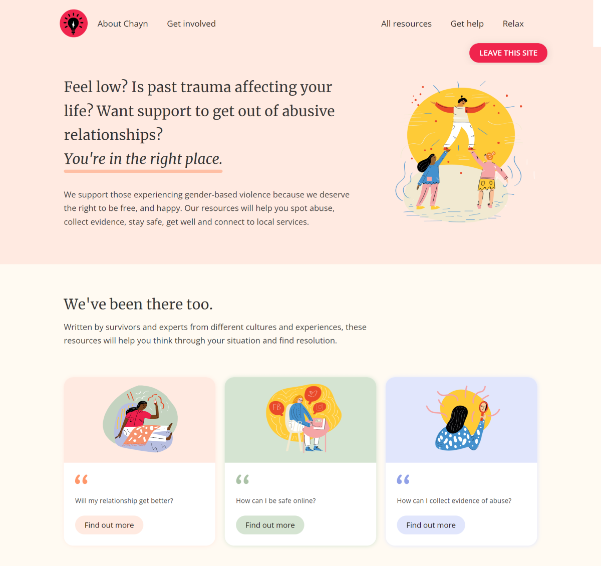
See how direct the title text is.
See how the content affirms that help is here.
See how simple the rest of the content is.
The visual design is hopeful, empathic and gentle. It’s designed to meet the needs of the people using the site.
Resources
- Read how to use content design to help people access your services more easily
- Learn the basics of content design using these Catalyst micro-teach videos
- Measure your content’s readability with Hemingway (free – this article scores 6!)
- Geek out on readability guidelines, based on tests with real people.
Wedi'i gomisiynu gan Catalyst
