
Charity Website Design Critique #2: Reach Volunteering
Author: Kat Quatermass;
Reading Time: 11 minutes
We've made this resource open. You are free to copy and adapt it. Read the terms.
If you would like more help with your digital challenge, book a free session with DigiCymru.
This was a series of articles written by Catalyst Resources which asked charities to submit websites for them to critique. They reviewed the design, gave feedback and shared this feedback so that others could learn from it.
We’re doing this because it’s often better to show rather than tell what good design is. We’ve already written plenty about good design.
Huge thanks to Janet Thorne for submitting reachvolunteering.org.uk for this second crit.
The Reach Volunteering site targets:
- people working in micro, small and medium-sized organisations
- professional volunteers who want to share their skills.
It aims to connect both groups in an impactful way.
Reach’s Head of Digital manages the site with support from a freelance developer who works mainly on the organisation’s database and digital services, including the website. They spend approximately £26k per year (2022) across both.
Note that any links to the Reach Volunteering website may, over time, lead you to pages that have been changed since this crit. What you see there may not match what you see here.
What we did
I’m a user researcher and content designer at Neontribe. I spent a couple of hours exploring and making notes on the site’s usability. Then I sat down with Rachel Harding, Neontribe’s UX designer for an hour to get an additional perspective.
We focused on 2 site pages:
- The homepage – because users don’t scroll down it much
- The “recruit volunteers” gateway page – because Reach think it doesn’t give a great user experience
Together we found lots of positives in the site. But because this is a crit we have only highlighted those design and usability issues likely to negatively affect the user’s experience.
Crit part 1: What should a home page try to do?
Reach were concerned that site users were not scrolling below ‘the fold’. The fold is the point at which the viewable area of a page ends. To see the rest of the page you have to scroll down, past the fold.

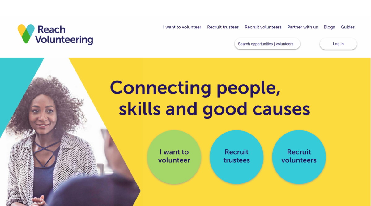
The homepage has a fresh clean look, with clear fonts and headers. Three strong call to action buttons are visible above the fold when you arrive on the page.
Here’s our advice for improving the page…
Build up trust, before big calls to action
Lower down the home page, there are some scattered elements designed to increase trust. This includes:
- the non-clickable section
- testimonials
- impact numbers
Reach should put the most important of these elements into a small trust building page component before the call to action buttons. We think the elements could all be individually improved too (see below).
They should use their research to see what their users need to feel reassured. If research shows users need a lot of different things, then they need to introduce more than one trust building component.
Putting these components before the call to action buttons will push the calls down the page. Reach might worry that this will slow down the user journey for people who already trust them. However the journeys are already available via the top menu bar. Most website users scan menus very quickly when they arrive at a site, so existing users will find these. To make it even easier, Reach could increase the menu size or use spacing to draw attention to the menu items.
Pick the right component or feature for the right task
This is an important web design principle.
Reach’s site has a non-clickable section of 4 items below the call to action. This will confuse some users.

The wording of the first 3 items suggests they are a call to action. Especially the second icon as it is a search icon. Users will expect these items to be clickable because of the words used. This could be a reason some journeys are ending.
Reduce the number of things you expect your home page to do
When we do usability tests on home pages, we find people often use the top menu or search bar to find what they want. This is particularly true for visitors returning to a site. So when organisations try to use a long home page to promote the different things they do, it isn’t always effective.
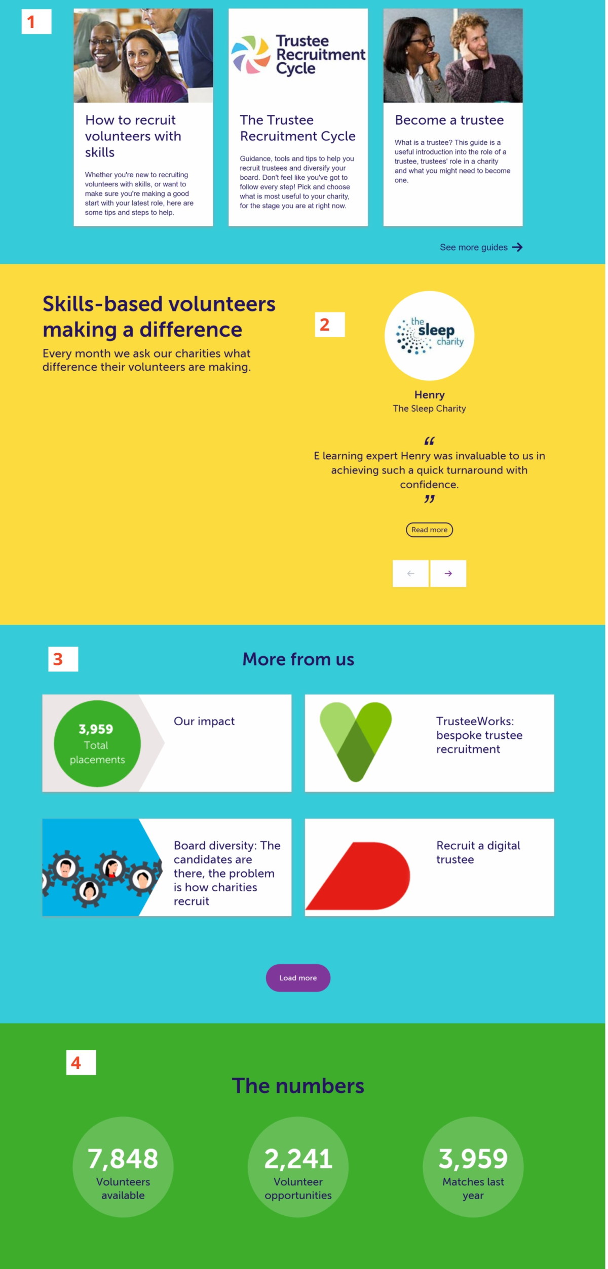
The Reach home page has several further horizontal sections of information below the 3 main call to actions. We recommend Reach reviews each one for usefulness to homepage users.

1. Guides section
This section lacks a title. A title would make it clear what what the 3 promoted items are. Also, this kind of homepage section is usually used for News or Blogs – content that is updated regularly. It is a way of offering new or recent content experience to visitors. Guides are unlikely to be the type of content that changes often.
There are two possible solution:
- Don’t use the homepage to promote the guides. Instead run marketing campaigns that take viewers to the guides landing page
- Create a call to action about how helpful the guides are and use it to take users to a landing page for these guides. If the call to action is subtle it could also build trust
2 Testimonials section
The two column layout doesn’t work well for readability on a computer screen as it pulls the eye in different directions.
The testimonial logo and content are the wrong way round.
Again there are two options:
- Use a redesigned testimonials component as one of the trust building features before the 3 main calls to action.
- Move testimonials relevant to potential volunteers to the volunteers signup page. Move testimonials relevant to potential recruiters to the recruiters page.
3. ‘More from us’ section
This introduces too much choice. There are already 5 menu bar options, plus the in-page call to actions. Placing a further 4 choices here is overwhelming for the user.
These ‘and also’ type of sections are have become common in charity websites. We think that it is trying to follow the design pattern of shopping sites that show ‘recommended for you‘ or ‘other people bought‘. But on those sites the content of these sections is personalised for each user based on their previous behaviour on that site.
We recommend removing this section.
4. ‘The numbers’ section
This is information we’d expect to see on an Impact page, and sometimes the homepage too.
Surprisingly, the discs containing the numbers are also clickable. However they don’t give the user any information about where clicking will take them. This creates an unsatisfactory user experience. Nervous users might even wonder what they did wrong.
There are different solutions, each one depending on Reach’s reason for putting these statistics on the homepage:
- If research suggests that numbers help build trust, then some of these statistics could be included in the trust building component.
- If Reach are worried that funders won’t be able to find Reach’s impact report (currently linked to from the 3rd disc) they could place it in the footer menu.
Crit part 2: What does an effective user journey look like?
Reach believe that the user journey for users looking to recruit volunteers is not smooth or clear. We agree. So we followed the ‘Recruit Volunteers’ call to action from the homepage. It took us to this landing page:

Here’s our advice for improving the journey for these users…
Simplify the choices you offer
Reach’s recruit volunteers landing page offers the user a confusing and overwhelming number of choices. We think there are positive intentions behind this decision. Users will have very different needs and wants from the page depending on where they are at in their process of recruiting volunteers.
However, the approach to meeting these needs is simply to offer a lot of free choice, via 5 different page components:
- 3 different calls to action in the second paragraph – two sentence links, one button
- A search box for finding volunteers
- A browsable carousel of volunteers (that are not the results for the search box)
- A carousel for browsing projects looking for volunteers
- Two more sections with multiple clickable areas (‘Guides’ and ‘More from us’).
We recommend 2 ways to make the page more usable, while still supporting different needs:
- Reduce the number of options. Only include the most relevant.
- Write strong instructional copy with every call to action to help users decide what to do next
Meet the main user need first
All page users will need to understand how to recruit a volunteer with Reach. This information is difficult to find. We recommend making it the first thing the page does.
One method would be some simple step-by-step content. For example:
How to find a volunteer with Reach
#1: Design your volunteer opportunity
#2: Sign up and post your opportunity
#3: Invite potential volunteers to apply
This content should not be clickable because it is there to deliver information. It should be followed with a choice of 2 calls to action:
1. Get ideas for your volunteer project
2. Ready to recruit? – sign up/join now
The ‘get ideas’ call to action could take the user to a new page that combines elements of the landing page with the advice about choices and design, below.
Alternatively it could go straight to Reach’s new Volunteer Project Library feature, which contains very similar elements.
Test the main call to action on this journey
The current main call to action is phrased as “join our community”. Some users will find this phrase off-putting. It will make them think of forums and places to go and share comments. Its not clear why this would be relevant to them and something they might not feel they have time to do.
We imagine that many happy existing users find the community useful. This might have contributed to choosing the particular phrase. So it is worth testing.
However the things we value after becoming part of something are not always the things we want or need to read beforehand. So we recommend testing the phrase against a simpler phrase such as “sign up”.
Tackle the design inconsistencies
The page, and the whole Reach site, has some small design inconsistencies. Together these make the experience somewhat bumpy and distracting.
1. Font sizes
A website should use consistent font sizing across headers, body copy, labels and notices. This recruit volunteers page introduces new font sizes for the search box and above the volunteer cards. These are inconsistent. Also, some are so small comparted to other components that they cause accessibility issues.
Solve this by setting a limited number of font sizes for the site.
2. Position and behaviour of the search box
The search box is small and confusing. It discourages uses. Then, when a user uses it they see volunteer results displayed in a different style to those on the page’s carousel. This will make some users unsure if they are viewing the same people.
Because this page feature connects with the database, there may be limitations on what Reach can do. They should explore what can be done to reduce confusion.
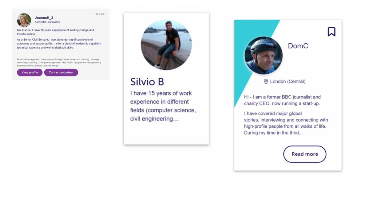
3. Consistency and usefulness of cards in general
Cards are used across the site. There are many different styles – some with strong branding and others without. On the ‘recruit volunteers’ page the ‘Guide’ cards appear differently to the homepage. Also, the ‘More from us cards’ also appear on a differently colour background to the homepage.


Many of the cards – particularly if they come from the database – also feature a long, cut-off description. This is not very skimmable when viewing.
Reach should audit all card styles used across the site.
They should aim for a consistent look and feel to cards, using shape, colour and icons to highlight different purposes.
They should look for opportunities to replace lengthy descriptions with shorter, skimmable information that does not cut-off.
4. Call to action buttons
The purple call to action buttons appear randomly across the page. This doesn’t help users build up ‘affordances’ (a picture of how things work on a site). Reach can make this easier by choosing a consistent location for these buttons (e.g. always in the middle, or always on the right etc).
All the design inconsistencies on this page and others on the site could be solved by creating a style guide or a design system for the site.
Crit #4: Reach’s Volunteer project Library
Read our review of Reach’s Volunteer Project Library. We talk about the difficulties any organisation has to cope with when they try and help people access a collection of resources.
Commissioned by Catalyst
